Stefanie Brechbuehler and Robert Highsmith, the architect couple behind in-demand Brooklyn firm Workstead, like to approach their commissions as DIY projects. Which is how they found themselves as well known for their luxe industrial lighting as for their fully designed interiors, inventive custom cabinetry always included. But for this project, an apartment upgrade in one of New York’s choicest settings—a Beyer Blinder Belle building on the grounds of the garden-lined historic General Theological Seminary, in Chelsea—Workstead recruited a group of local fellow craftsmen to collaborate with them.
“Taking inspiration from the location, in the heart of Chelsea’s gallery district, we treated this project as if curating an exhibition,” they say. The apartment belongs to a couple with a one-year-old: David, who runs a hedge fund, and business consultant Monica Chambers, who became another of Workstead’s recruits—after getting to know the team during the months of renovation, she’s now the firm’s COO.
Photography by Matthew Williams, courtesy of Workstead.
Above: “David and I wanted Workstead to help us take a brand-new white box and infuse it with a sense of place,” Monica told us. “They needed to be able to take our modern design sensibility and make it feel natural in the context of the gorgeous Gothic seminary that surrounds us.”
A bar of blackened walnut with a leather top by Asher Israelow divides the dining area from the living room, while allowing a loftlike feeling of openness. The couple owned the live-edge table but Workstead added new legs: “It had a very clunky wooden base; we asked Asher Israelow to lighten it up with a black and brass base.”
Above: A plant-lined window ledge connects indoors to out and lends a low-key vibe to the family room, furnished with Workstead’s leather Sling Chair and ottoman and long-armed Corner Lamp.

Above: The room features a dramatic wall of brass cabinets built by metal specialists Ferra Designs.
Above: “We were inspired by the simplicity of lockers and their punched out handles,” says Stefanie. “The cabinets are blackened metal on the outside and cherry on the inside; they were quite a feat to fabricate.”
The desk is by Moran Woodworked and the table lamp is Workstead’s Helios. Of their many maker collaborations, Stefanie explains: “We began by identifying the design concept and developing the preliminary drawings for each piece. Then the challenge became finding the right artisans, fabricators, woodworkers, and metalworkers. The process of selecting our partners was equal parts creative, technical, and interpersonal.”
Above: Workstead chose a metal finish that will wear off from being touched, much, they note, like a Botero sculpture: “Where the family opens and closes the cabinets, gold will emerge.”
Above: The kitchen is an existing design that Workstead tweaked by introducing black metal pulls and dark elements, including Joe Colombo’s palm-size Fresnel ceiling light and Joshua Vogel’s Blackline Cutting Boards.
And the charred wood curiosity in the background? It’s an entryway piece by Michael Moran, who was commissioned to create “a cross between art and a place to sit and tie shoes and drop off a set of keys.”
Above L and R: The apartment is two combined units that the couple purchased when the building was being developed and includes a hall to the bedrooms. Scenic painter Raechel Legakes treated a formerly white wall with a textured finish made from plaster and paint. Say Workstead, “The connection of opposite and contradictory forces helps the design achieve balance: dark and light fields, color versus achromatism, plush and rough.”

Above: The brass-detailed dressing area is painted Farrow & Ball Railings.
Above: “We wanted to create a bed that felt like a world, a place that would invite you in and allow you to sleep, work, and chat on the phone,” say Stefanie. “We took the platform bed idea and created the basic shape and size at which point we turned the design over to Asher Israelow. The wood and brass rivers all came from him.” The waffle textile behind the bed is by Hiroko Takeda.
Above: The bed frame has a built-in slot for a laptop.
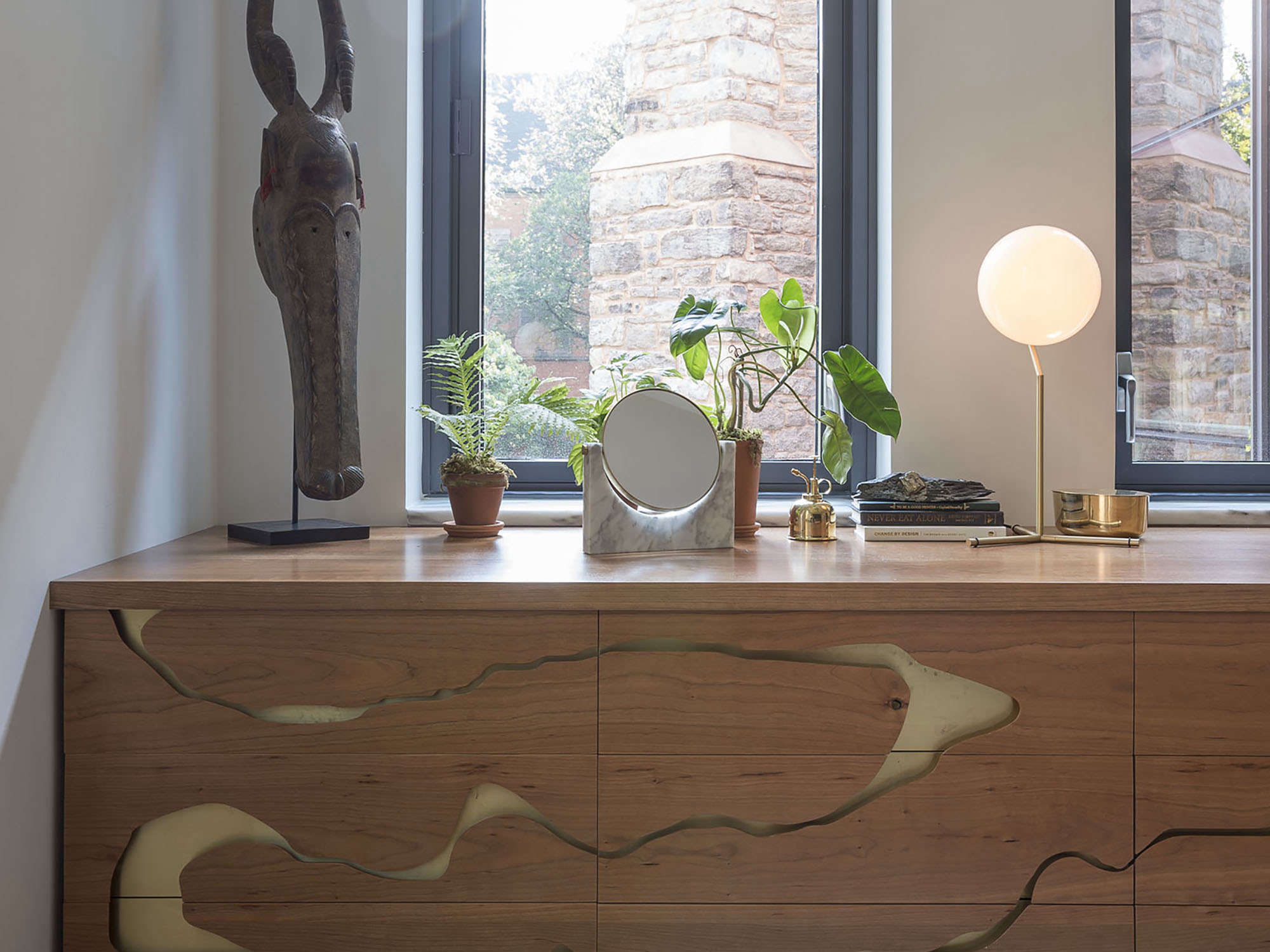
Above: A companion dresser also has brass rivers.
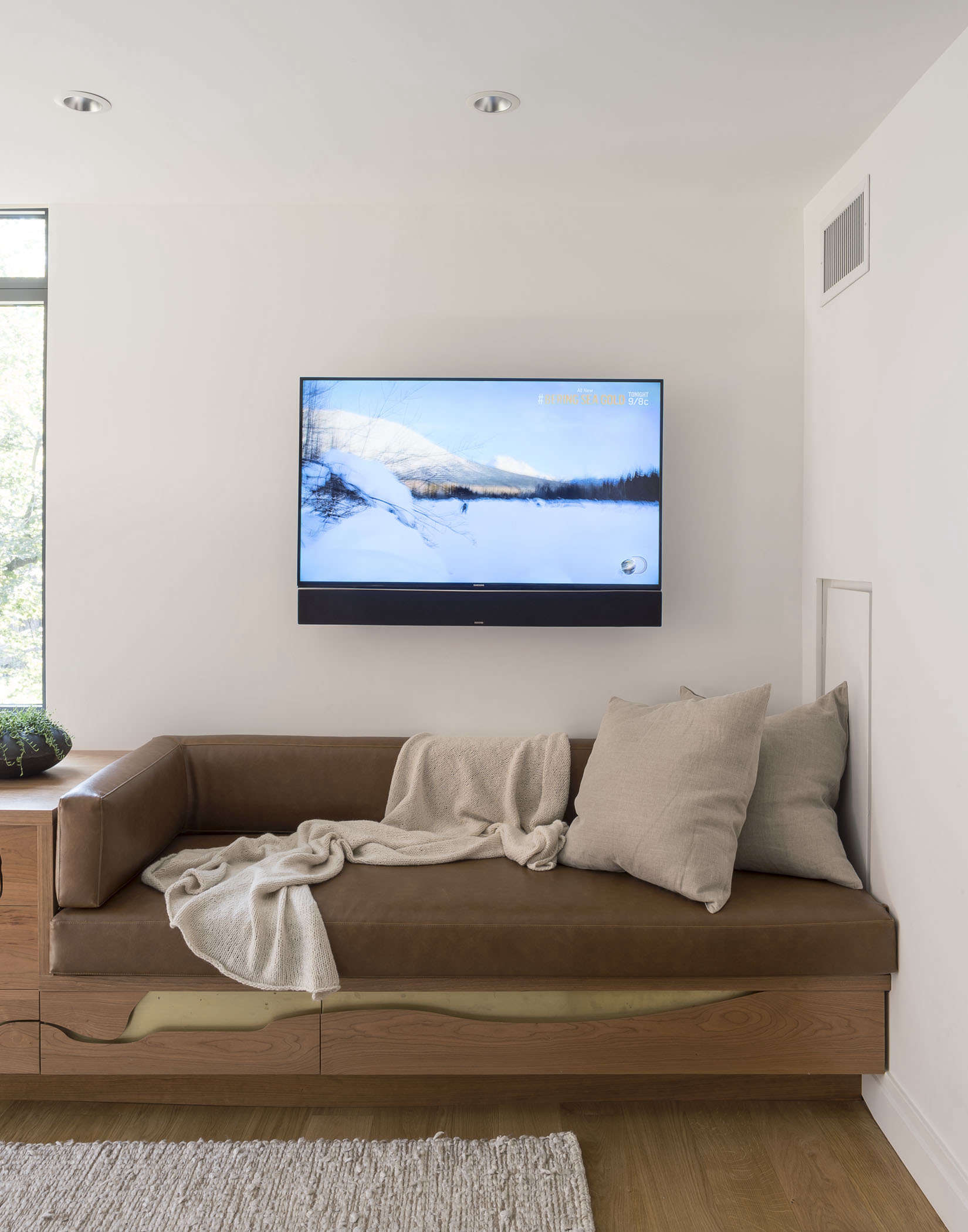
Above: The dresser is linked to a leather-cushioned bench that serves as a bed for the family’s German shepherd. “It’s hard to find a dog bed that’s attractive and fits the layout of the room, particularly for a big dog,” says Stefanie. “We thought, why not build it in, so it doubles as place for the couple to sit?”

Above: Brooklyn interiors paint pros 3 Fingers Painting lacquered the powder room in a deep green from Fine Paints of Europe. The mirror is the KBH Frame Mirror—seeArtisan-Designed Fixtures from Denmark—and the brass sconces are by Workstead.
Above: Foret Noire wallpaper by French artist Nathalie Lété and a cast-iron crib in the nursery.
Above: Succulent-lined sills and a tufted loveseat.
Above: Black can work for babies: The room is painted Benjamin Moore Toucan Black.
Explore more of Workstead’s projects:


Have a Question or Comment About This Post?