My friend Wendy Furman, an artist and graphic designer, high-tailed it out of LA six years ago, trading her Laurel Canyon home for a funky 1940s cottage overlooking vineyards in the Napa Valley. Overnight she went from nearly a thousand square feet of living space to 643 square feet. Smog-free living for idyllic vineyard views was an easy trade, but how to adjust to the smaller space?
Fortunately, she has honed a clean minimalist look over the years. The Arizona native, who confesses to having known more about architecture than boys by sixth grade (she went to school with Frank Lloyd Wright’s granddaughter and was already familiar with his Arizona winter home,Taliesin West), was an early adopter of Neutra and California Arts and Crafts when she first moved to LA. Her affinity for midcentury design was further solidified by a year in Stockholm, where she embraced Swedish modernism.
Tackling the cottage, she armed herself with cans of gallery-white paint and created a neutral palette that allowed the objects to fill the space, a technique she had learned working with museums and galleries over the years. She put her extensive art collection in storage; and throughout the year, she rotates her pieces to keep the space fresh. As she puts it, “I shop the things I have.”
Photography by Mimi Giboin for Remodelista,

Above: Wendy in the doorway. She opened up the connection between the living room and the kitchen by removing the divider in the opening.
Above: Wendy removed the doors from the cupboards to create open shelving. She painted the whole space in Behr Ultra Pure White with, as she says, “an extra hit of Pure White, around 5 percent. They think you’re nuts when you ask for it at the paint store, but it makes the white colder and more opaque.” The four ceramic containers on the countertop are local Californian pottery and are one of the first things Wendy bought when she moved to LA at 23.

Above: Wendy painted the frames white and the back wall a custom flat graphite gray to tie into the gray couch in the living room. The gray also provides a contrast for the white dishes on display—an installation of sorts. The leaf bowl is by Gregg Moore, a recent discovery.

Above: A collection of green bowls sit atop an Ikea cabinet with a collage by Bill Radawec propped against the wall.
Above: Wendy, who describes the interior of her cottage as “looking like a flop-house” when she first moved in, replaced the base cupboards with Varde Kitchen Drawers topped with Varde birch counter tops from Ikea; she inserted a wine refrigerator in the space intended for a dishwasher. (An larger refrigerator sits in the hallway.) Lamenting the loss of her Viking range, she kept the original O’Keefe and Merritt gas stove, noting that “If you have to have an old stove, this is what you want.”
Above: A tray with pieces from Wendy’s collection of Russell Wright ceramics sits on a Parsons Dining Table from West Elm. (One of Wendy’s first art installations involved a piece of Russel Wright hanging on the wall). The Thonet chairs are custom covered in 1950’s Knoll green fabric. She replaced the kitchen and dining room with laminate flooring.

Above: Wendy uses a second bedroom as a showroom for her newly launched business, Whim & Caprice. A Bertoia chair sits in front of a set of maple bookshelves that she commissioned from an LA furniture maker years ago. On the wall is a sculpture by Steve DeGroodt.

Above: Wendy designed the wardrobe and had it custom made in solid maple.

Above: Wooden shelving between the two bedrooms is used to display art.
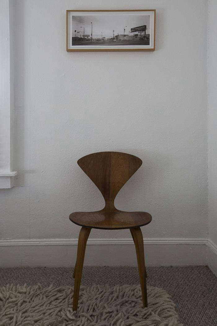
Above: One of a pair of Cherner side chairs atop a Nesta Rug from Design Within Reach.
Above: An Ikea floor lamp sits beside a Case Study V-Leg Bed from Modernica.

Above: A screen door with view onto the vineyards. A Noguchi Lamp sits on a Roy McMakin wooden table.
To see Wendy’s pieces, check out our post on Whim & Caprice. And here’s another compelling take on a Napa Valley Cottage, this one remodeled.
See more of our posts on Napa Valley Living.


Have a Question or Comment About This Post?