It all began with a request for a Band-Aid.
Designer Brad Sherman, newly arrived in New York and crashing on a friend’s sofa, was working as a receptionist at communal workspace General Assembly. Merrill Stubbs, cofounder with Amanda Hesser of cooking and e-commerce site Food52, had cut herself and approached Brad for first aid. When the two started talking about Food52’s planned move to its own office, Brad, who has a master’s degree in sustainable design, mentioned he had just left a job creating offices out of reclaimed materials for recycled goods specialists TerraCycle of New Jersey.
“I didn’t have a portfolio, but working with trash taught me how to be extremely resourceful,” says Brad. That was a mere three years ago, and Brad not only got the job designing Food52’s quarters–see Steal This Look: A Cooking Site’s Own Kitchen–but has since become NYC’s go-to guy for cash-strapped startups looking to create stylish headquarters.
To keep up with demand, Brad has since teamed up with interior designer Nina Etnier, a school friend with a degree from London’s Chelsea College of Art and Design and a background in high-end residential design–“While Brad was building desks out buckets and doors, I was speccing $5,000 chandeliers.”
Food52, too, has been expanding, and Brad and Nina recently completed the design for the company’s 6,000-square-foot new office space in Chelsea, just blocks from the original–and equally cost-conscious. We especially like the staff kitchen, which is full of ideas to steal.
Photography by Mark Weinberg.

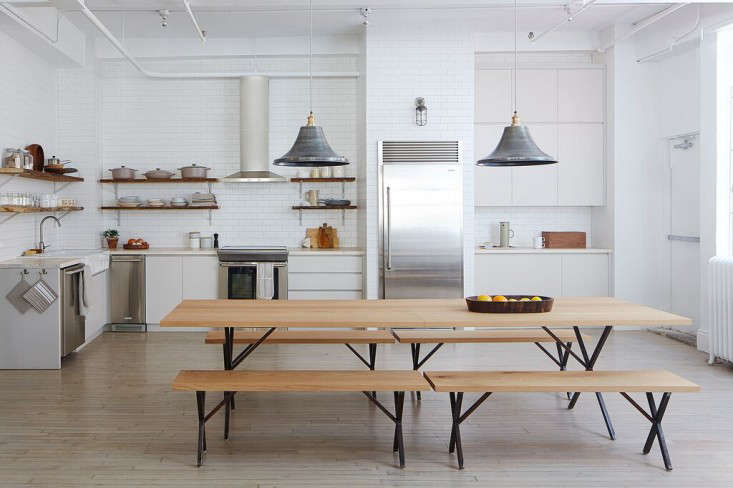
Above: “This is the darkest corner in the entire space, so every decision we made was motivated by creating a sense of lightness: a light palette and simple clean design helped achieve this,” says Brad, adding that they were also guided by budget: “Although it may not look like it, this kitchen needed to be done as inexpensively as possible. We reused the reclaimed shelving from the old office, sourced $11 Shelf Brackets on Amazon (and painted them the same color as the cabinetry), and purchased the farm sink, faucet, and butcher block counters from Ikea.”
The splurges? The cabinets are custom–”but, in truth, they really didn’t cost that much more than Ikea in the end. The space is very uneven and would have required a lot of adjusting if we had gone with readymade,” says Brad. Another custom detail: The center-of-attention 10-foot-long table and benches were designed by Brad and Nina of solid white oak–the ensemble will soon be available in Food52’s online shop. As for the hanging lights, they’re Brooklyn Vintage Giant Bell Lampshades in a pewter finish from UK company Industville and cost £89 ($137) each: “There are so many straight lines in the kitchen, we needed something to break them up. It was a very happy day when we found these–and they were in stock,” says Brad.

Above: Brad and Nina went with flat-panel cabinet fronts for aesthetic as well as practical reasons: “They have a minimal, almost Scandi appeal that allows the focus to be shifted to the wares. And because there are no grooves or moldings to catch dirt, they can just be wiped down.” Made of MDF, they’re sprayed with a matte lacquer finish, Purbeck Stone, a soft gray from Farrow & Ball. “The gray is subtle, but it adds a soft tonality,” says Nina. “The kitchen would have a lot less depth if it were a stark white.”
The space is approximately 600 square feet, which the designers divided into two halves by inserting an Electrolux Single-Door Built-In Fridge in the middle (“The enclosure is just studs and drywall that’s tiled). The left side of the fridge is the food prep area and the right is the coffee station with electrical outlets for coffee makers and a tea kettle. “The counter depth had to get shallower close to the exit; having a dividing line made that look intentional and also allowed us to neatly insert a wall of overhead cabinets next to the open shelving,” says Nina.
The appliances came from Electrolux, one of Food52’s sponsors. The sink is flanked by a 24-Inch Built-In Dishwasher (left) and 15-Inch Under-Counter Ice Maker (right). There’s also a 30-Inch Induction Range with a Wall-Mount Hood.

Above: The pale butcher block is the result of applying a bleach solution three times to get the color and uniformity right: “Red oak plywood is less expensive than white oak and can be lightened to look almost the same,” says Brad. It’s finished with a food-safe sealant.
The office’s existing flooring, “a yellowing pine with patches of oak, completely inconsistent and all a terrible color,” were upgraded (and made uniform) with a stain that the designers, after several unsuccessful tries with their crew, mixed themselves at the hardware store: It’s Minwax, three parts white, and one part gray.
The newly built back wall–detailed with transom windows (that use Plexiglas found in the space and faux mullions)–is a behind-the-scenes operations center: Etsy pegs hold extra chairs (from Crate & Barrel), there’s a laundry station, and wall-hung bike rack.

Above: The room’s matte white subway tile applied throughout–”we wanted to push it as a motif instead of just a backsplash”–is three-by-six Campus Field Tile from Waterworks, another of Food52’s sponsors. Most of the kitchenwares come from the Food52 shop.

Above: A pantry is stocked with pullout drawers of maple ply–”very cost-effective,” says Brad, “we also used it inside the staff kitchen cabinets.”

Above: Spices are organized alphabetically. “The most sucessful kitchens have a place for everything,” says Brad, explaining that the drawers on the right side of the kitchen are shallow–only 4 1/2 inches deep: “This prevents any cooking utentsils from being stacked on top of one another–everything is easily seen and organized.”
Above: There’s even a washer/dryer–for laundering tablecloths and other linens–and a laundry sink. Coincidentally, we featured the same Kohler Bannon Service Sink in this week’s Steal This Look. Here, it’s painted Farrow & Ball Calke Green. The faucet is the “most standard, inexpensive utility gooseneck on Amazon.”

Above: A gathering area outside the kitchen has bench cushions and throw pillows (made of leftover Knoll sofa fabric in chenille wool and mohair) that were stitched by a local dry cleaner. “We got quotes from upholsterers, but our dry cleaner was much more affordable,” says Nina. “Each pillow cover was $20 and we bought the inserts on Amazon for $9.99 each.” The benches open to supply wine storage.
The pedestal table is from Crate & Barrel and the leather Folding Stool came from Urban Outfitters. The paneling is MDF: “We cut down four by eight boards into four-inch strips,” says Brad. “Pine was too expensive, but we were able to achieve the look.” The wall is painted Benjamin Moore Icicle, a warm white with a slight hint of green.

Above: Another of the designers’ farmhouse tables is situated outside the office conference room and surrounded by Windsor-style Willa Dove Dining Chairs from Crate & Barrel. Made in Brooklyn, the table has patinated metal legs and a seamed white oak top: “It’s in two pieces because the freight elevator was so tiny,” says Nina. “Some of the cabinetry had to be walked up eight flights. We had no choice–there’s no hoisting furniture on a budget.”
Remodeling? See more of our Kitchen of the Week picks, including Epoch Films’ Industrial Friendly Office Kitchen and the $350 DIY Kitchen Overhaul in Two Weekends.


Have a Question or Comment About This Post?