One benefit to spending years designing kitchens for others is that when you’re ready to design your own, you know exactly what you want. Such was the case for LA interior designer Amy Sklar, who wanted beauty in her own kitchen–but wanted efficiency even more.
Sklar set out to design her dream kitchen in the 1936 “Colonial Revival” style bungalow she’s shared with her husband for 13 years. The house, in LA’s Silverlake neighborhood, came with plentiful period details and a desperate need for an update. Over the years, Sklar and her husband added two daughters and one “very drooly” English bulldog to their family, so by the time renovation was in the cards Sklar knew practicality was key. So was an adherence to a budget. As advice to fellow remodelers, Sklar sums up her philosophy on both utility and spending: “Not everything has to be top of the line,” she says, “but the things that will get heavy use should be good quality. It’s a tragedy to have to replace things after a short time.”
Photography by Amy Bartlam.

Above: Because she cooks for her family every night, Sklar’s overarching goal was to design her kitchen for efficiency. To her, an efficient kitchen is one that follows the old adage: “A place for everything, and everything in its place.”
Sklar chose an East Linear faucet from Newport Brass, Calacatta Delicato marble countertops, and Benjamin Moore Black Iron for trim on the original bay windows. Her countertops taught her an important lesson: White marble is a good choice for a family kitchen if you accept this as truth: “Marble will patina.”

Above: “Digging for a pot or utensils gets old when you cook every night,” says Sklar. To eliminate the problem, she outfitted every cabinet with interior fittings designed for specific cooking tools, such as a vertical pullout tray for baking pans and flat pullout drawers for bowls and serving pieces. To banish countertop clutter, she added appliance garages for the toaster, coffeemaker, and laptop and cell phone chargers, plus a hidden set of drawers to stash paperwork and kids’ homework supplies.

Above: Like most people, Sklar and her family had to keep budget top-of-mind. She purchased materials over the course of a year to distribute costs over time, and chose her splurges carefully: Thermador appliances (range, hood, refrigerator, and dishwasher) and Kitchen Aid wall ovens to last for the long haul, plus a light touch with the pricey cabinet hardware she fell in love with: “I chose solid white bronze handles and pulls; they were a splurge, but they feel good in my hand every time I open a cabinet and they patina so beautifully.” For the lesser-used island and pantry, Sklar used inexpensive hardware from Anthropologie.

Above: To avoid a pricey overhaul, Sklar worked with the existing placement of windows and doors–meaning flexibility in layout was minimal. “We toyed with the idea of knocking down the wall between the kitchen and the dining room, but in the end the expense–coupled with the fact that I am a sucker for a formal dining room–made the decision for us.” Sklar used Benjamin Moore White Dove for the walls and Pale Oak for the cabinets.

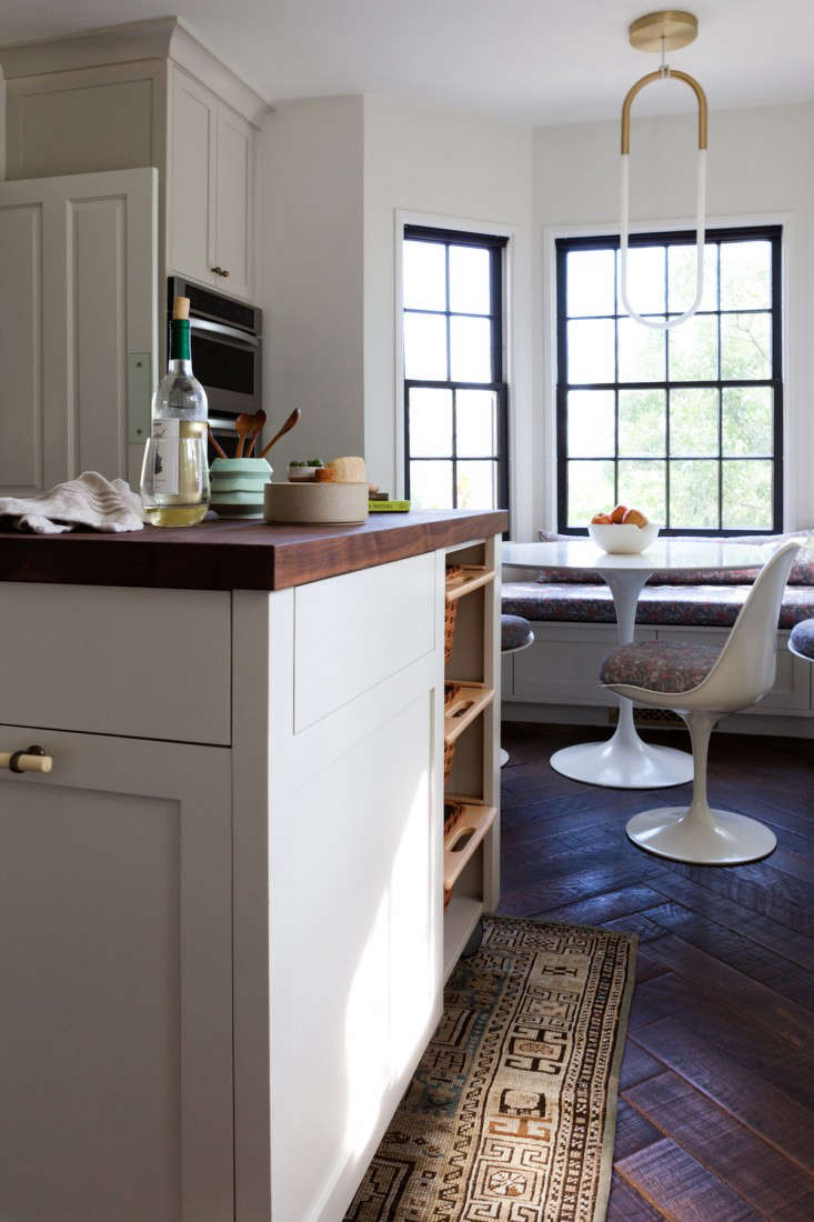
Above: One of Sklar’s favorite features is her custom walnut butcher-block island on casters. The island hides the trash and recycling bins, and can be easily tucked away for party time. “For big holidays where there are a lot of people milling around, it nests back against the wall near the kitchen table, so I still have the counter space but with more floor area for standing guests.”

Above: The breakfast nook sports a Saarinen Tulip Table and Chairs, a Rudi pendant light from Roll & Hill, and Khotan Rubia upholstery by Zak & Fox. One thing Sklar learned from spending years designing other people’s kitchens: “Laminate the seat cushions in homes with kids!” Sklar’s distressed floors are from Martin Lane–”They are so forgiving with spills,” she says.

Above: In the bay window above the sink, an art print by graphic artist Gregory Beauchamp and a Heath Ceramics bud vase by Adam Silverman.

Above: Sklar’s catchall pegboard storage for pots and pans is a copy from her mother–”a great cook and pastry chef”–who had been inspired by Julia Child’s own pegboard rack. Says Sklar, “It’s just so easy to grab what you need, and to me the pans feel like art.”

Above: The door off the hallway is painted in Black Iron by Benjamin Moore and the wall hooks are from West Elm.
Browse more kitchen inspiration in these Kitchen of the Week posts:


Have a Question or Comment About This Post?