Lots of Hollywood offices have movie-star swagger, but few are as stylishly original as the Epoch Films setup in a 1940s Beverly Hills warehouse that had been a brass foundry. Originally designed back in 2000 by architect Finn Kappe and Pamela Shamshiri of Commune, the space recently received a refresh, and what stopped us in our tracks is the newly overhauled kitchen. The work of Frances Merrill of Reath Design, who Shamshiri recommended for the update, it makes the most of the existing concrete backdrop while introducing a wood-accented warmth that Merrill labels “friendly industrial.” We say: Rush to see it.
Photography by Laure Joliet, courtesy of Reath Design.
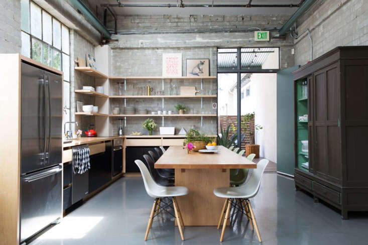
Above: The new kitchen replaces a space with a half fridge and, in Epoch executive producer Melissa Culligan’s words, “white laminate cabinets where boxes of half-eaten office snacks got lost.” (Scroll down for a Before shot.) Since the renovation, she tells us, “It’s now the heart of the office. We all cook and eat together: Eggs, oatmeal, therapy, it all goes down in the kitchen.”
Our favorite element, the two-toned vintage cupboard, was the first piece of furniture bought for the space (from Nickey Kehoe), and became the inspiration for everything. “It had age, character, and color, all things we wanted to introduce,” says Merrill. “Blending the vibe of that cupboard with the industrial feel of the room was the crux of the design. And it also allowed us to demo all the closed storage on the main wall since it supplied a place to store the less appealing looking necessities.”
The walls and steel window are original, as are the beams—after much testing of colors, the beams and back door were painted Benjamin Moore Caldwell Green (“It feels light and somehow inherently California,” says Merrill). The floor is epoxy; originally in a bright blue that got very beat up, it’s refinished in a neutral gray. All else is newly introduced. The custom maple table is by LA cult furniture maker Shin Okuda—see more of his work in our post Tiny Altars.
Above: The warehouse window supplies the perfect spot for the inset sink, which has a Kohler Deck-Mounted Chrome Faucet. The counters are paint-grade maple, also used for the cabinets and shelves.
Above: The simple open shelving holds tableware in a carefully selected neutral palette: a Tom Dixon brass Form Jug, ceramics from Heath (the Mugs are from the Coupe Line), and a wood and melamine Joseph Joseph White Bread Bin.
Above: The cabinets were custom built (and along with the table, the biggest splurges of the project). “To save on cost, we used paint-grade maple,” says Merrill. “We painted the cabinets in Benjamin Moore Black in a satin finish, and ending up deciding to leave some sections unpainted—they’re oiled in a satin finish.” The unpainted wood forms the counters and continues as a frame around the French-door fridge, lending it a custom look. All the appliances are by Jenn-Air; as a space saver, the wall oven is mounted under the cooktop.
Merrill sourced the artwork from Etsy and Nickey Kehoe.
Above: Are well-designed, fully loaded kitchens the answer to office happiness? “We all spend so much time at the office, but so much time thinking about what our houses look like,” says Culligan. “This remodel has done so much for the culture of the company.”
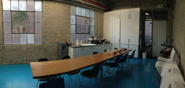
Before
Above: The kitchen was a place for grabbing coffee and meetings (and storing extra chairs).
See more of Merrill’s work at Reath Design. And take a look at more of our Kitchen of the Week posts, including The Ultimate Indoor/Outdoor Kitchen.
For another LA office kitchen that we adore, see Biscuit Film Works in the Remodelista book and Steal This Look.
N.B.: This post is an update; the original story ran on May 21, 2016.


Have a Question or Comment About This Post?