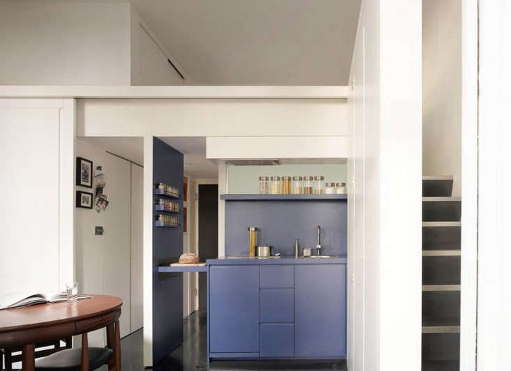
When a young, single Londoner set out to buy an apartment in the center of the city, she discovered she had two options: She could afford to buy a characterless one bedroom, or she could downsize to a studio and have some money left over to make it her own.
She opted for a tiny studio—just 290 square feet—with high ceilings and charming details, and partnered with Jennifer Beningfield of Openstudio Architects (members of the Remodelista Architect/Designer Directory) to transform it into an adaptable living, working, and cooking space tailored exactly for her. The pair co-opted half of the high ceiling as a sleeping loft—adding another 80 square feet—then created a masterful modular plan for the main room.
There, the kitchen and office space remain hidden when not in use. Says Beningfield, “The problem with open kitchens in small spaces is that the entire space looks like a kitchen, with all the mess (or constant cleaning up) that entails.” Beningfield painted the room a warm white and cleverly assigned bright colors to its customized features, so that the kitchen or office define the space when engaged, but fully retreat when not in use. “The idea was to create a room that moves and changes around the client,” says Beningfield.
Photography by Richard Bryant, courtesy of Openstudio Architects.

Above: The studio’s blue kitchen is tucked under the sleeping loft and, when its sliding track door and folding doors are open, it overlooks the main living space. The kitchen’s leftmost wall slides away from the fixed countertop to provide extra prep space via the bread board.

Above: The kitchen is shown here half-open to the living room. Almost unbelievably, the architect managed to fit a sink, refrigerator, freezer, dishwasher, oven, and induction range within the compact space.
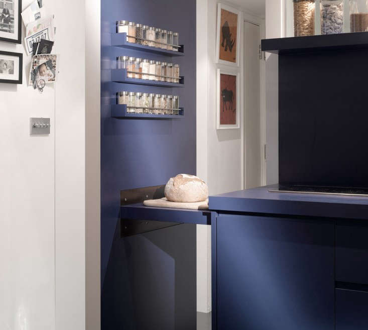
Above: The kitchen’s blue surface is laminate from French company Polyrey. The white cabinets are polyurethane lacquer over MDF.
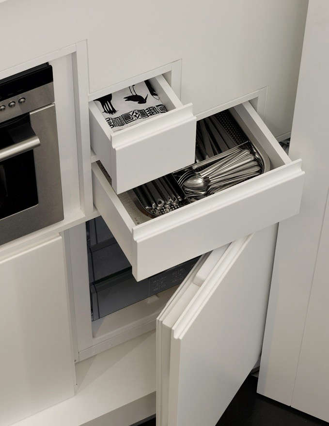
Above: The kitchen drawers line up with the rise of the stairs to the sleeping loft. Says the architect, “Everything fits together like a three-dimensional puzzle. We used every inch of available storage space.”

Above: When its doors are closed, the kitchen is completely hidden from the main room.
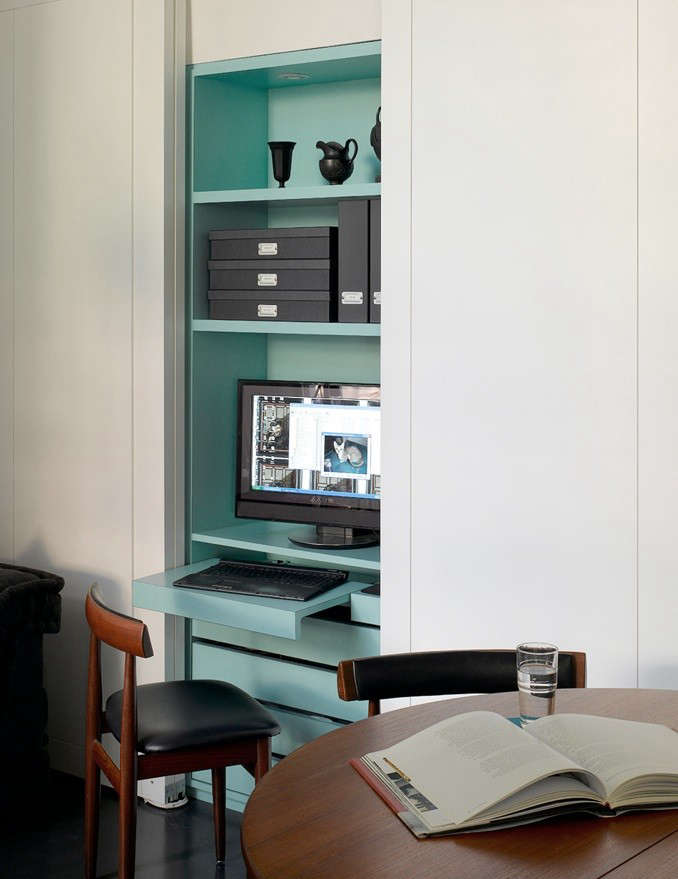
Above: The office space is set off in turquoise. Like the kitchen, it can be put to use or concealed behind doors as desired.
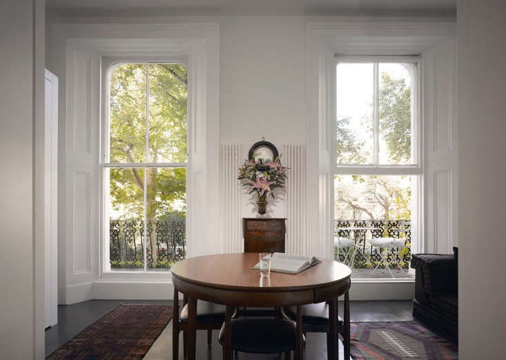
Above: Though the apartment is small, it has height and character: Its tall sash windows open onto a small balcony and communal garden.

Above: The floor plan of the 290 square-foot main room details the architect’s color-coded, shape-shifting solution for the space.
For more small-space solutions, see:


Have a Question or Comment About This Post?