0
false
18 pt
18 pt
0
0
false
false
false
/* Style Definitions */
table.MsoNormalTable
{mso-style-name:”Table Normal”;
mso-tstyle-rowband-size:0;
mso-tstyle-colband-size:0;
mso-style-noshow:yes;
mso-style-parent:””;
mso-padding-alt:0in 5.4pt 0in 5.4pt;
mso-para-margin:0in;
mso-para-margin-bottom:.0001pt;
mso-pagination:widow-orphan;
font-size:12.0pt;
font-family:”Times New Roman”;
mso-ascii-font-family:Cambria;
mso-ascii-theme-font:minor-latin;
mso-hansi-font-family:Cambria;
mso-hansi-theme-font:minor-latin;}
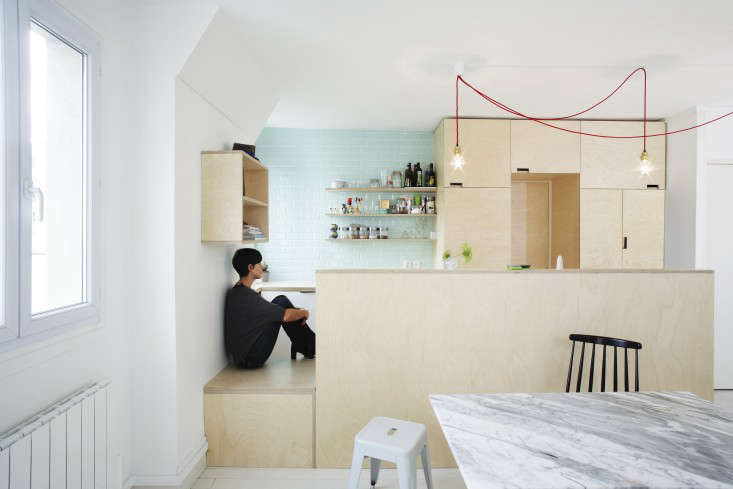
Last touched in the 1970s, this apartment in Paris’s 19th Arrondissement was, according to architect Lina Lagerstrom, of Septembre, “divided into a lot of small rooms and in very bad shape.” The owners, a young family of four, called in the Septembre team to create an open kitchen/living room in Scandinavian style with birch plywood, white paint, and a hint of mint.
Photography by David Foessel.

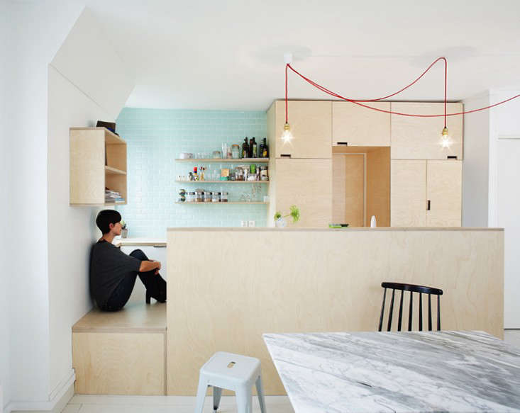
Above: The remodel was done for a creative couple, Sabine and Alexis–she’s a graphic designer, he’s a writer/comedian–who wanted a combination of “bright, lively, and cozy.” Birch ply cabinetry defines the kitchen from the rest of the room, and the walls, ceiling, and floor are white (“painted floors are unusual; Parisians are used to their oak parquet,” says Sabine).

Above: The carpentry is the work of Fred de Gasquet of FredFabric. The tall cupboards (which hide the fridge) surround the door to the bathroom.

Above: The low perch dividing the kitchen and living area is a storage space with a removable wooden top for bottles of wine and water. Mint subway tiles and red light cords provide the requested color. See our posts on the Color Cord Company and Wrk-Shp for similar pendant lights.

Above: A trio of mismatched chairs surround the marble-topped table. The white column was a surprise during construction: “We found a bearing post in one of the walls we planned to demolish,” explains Sabine. “It was a big deal at first, but we got used to it–we even like it.”

Above: The double-exposure windows overlook the rooftops of the Right Bank. Sabine’s final word: “It’s a great place to cook while watching the kids–well-conceived and functional. And from the sofa, it offers a great view.”

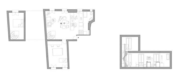
Above: Septembre’s plans show the bedrooms and bath off the kitchen and the spiral stairs to the roof.
For kitchens with a similar palette, mint tiles included, see Steal This Look: A Mint Green Kitchen from a Scandinavian Stylist and Steal This Look: A Kitchen in Gothenburg, Sweden. Also check out 5 Favorites: Minty Bathrooms, Retro Edition.
Thinking of building your own plywood kitchen? Read Remodeling 101: The Ins and Outs of Plywood. (And take a look at blue plywood here.)
For more inspiration, browse the Kitchens in our photo gallery. (Search by color and materials to find the look you’re after.)
This post is an update; the original ran on February 27, 2015, as part of our Clean Living issue.


Have a Question or Comment About This Post?