
As a former New Yorker and current owner of a wee Cape Cod cottage, I am quite familiar with both the charm and challenges of small spaces. When done well, they can feel like cozy, Zen-like retreats. But often when you have to cram all your worldly possessions into one tiny space, the results can feel cramped, claustrophobic, and anything but restful. Achieving the former instead of the latter takes some conscious effort.
The good news is that the key to successful small-space living might be easier than you think. It all boils down to tricking the eye into perceiving more space by employing three simple concepts: scale, light, and movement.
1. Scale it down.
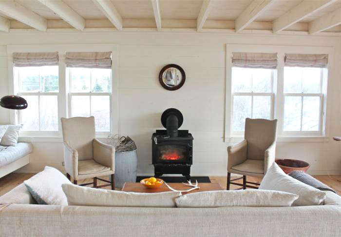
Furniture for the small space is all about proportions. Simply put, if a piece brushes up against the boundaries of the room, either up and down or sideways, it’s too large. To create a sense of roominess, always leave a little air in between the sides of your furniture and the walls. (The one exception is a bed; a queen placed between two walls, for instance, creates a cozy sleeping cave.)
Also avoid heavy, weighty pieces that eat up too much of the usable space in the room. For example, a sleek sofa or chair will give you as much sitting room as its overstuffed cousin but will take up much less of your room. If you long for a large, statement piece (a piece of art or mirror), hang it on the wall. Don’t consume valuable living space by putting it on the floor.
2. Keep a low profile.
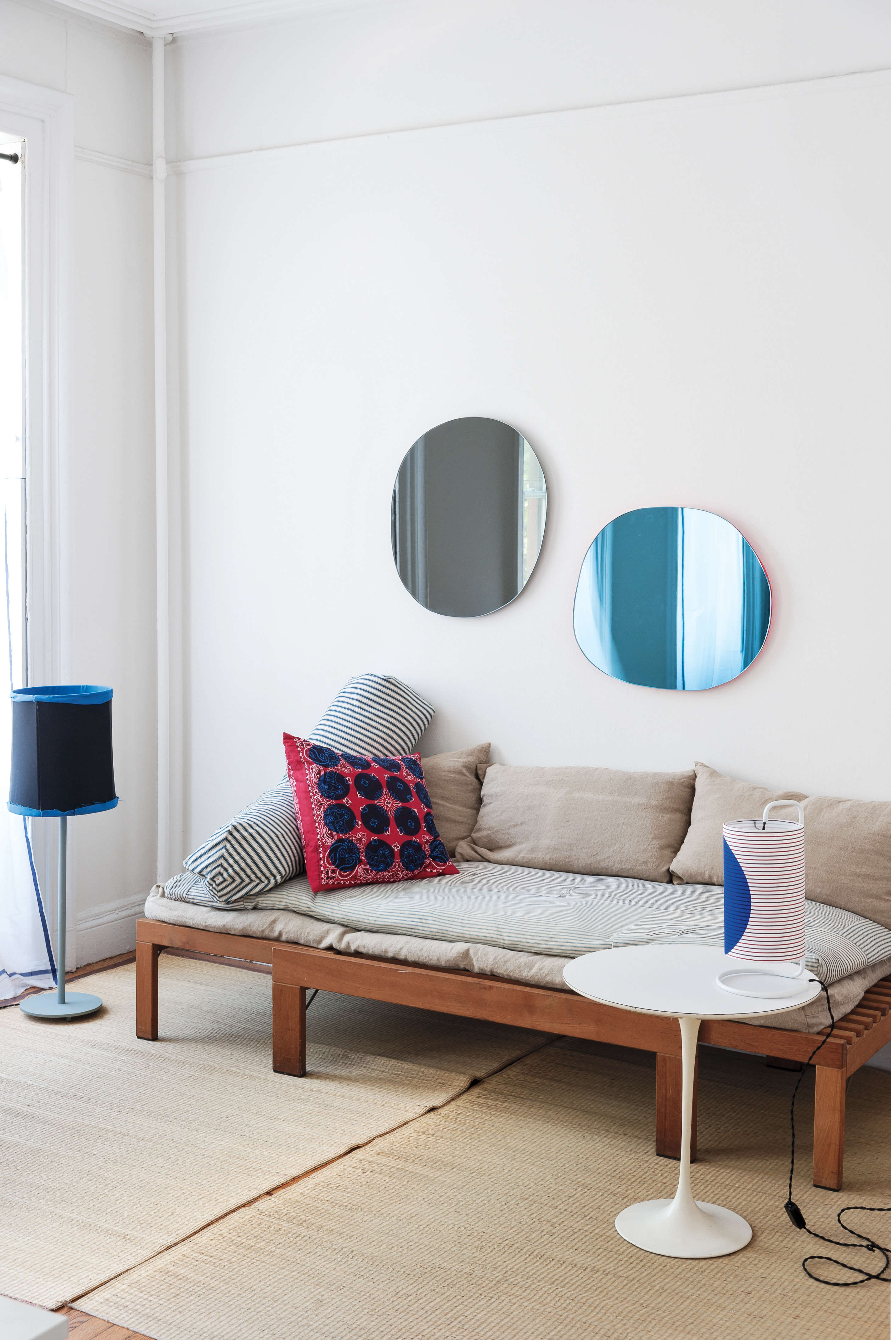
Furniture that is lower to the ground will create a feeling of openness in a room simply by the fact that they leave more space above them. In the bedroom, choose a loft bed or even try placing a mattress directly on the floor. In the living room, embrace your inner Mad Men style with low-to-the-ground midcentury pieces. Or, if your tastes run more toward the romantic and ornate, 19th-century furniture also has a low profile.
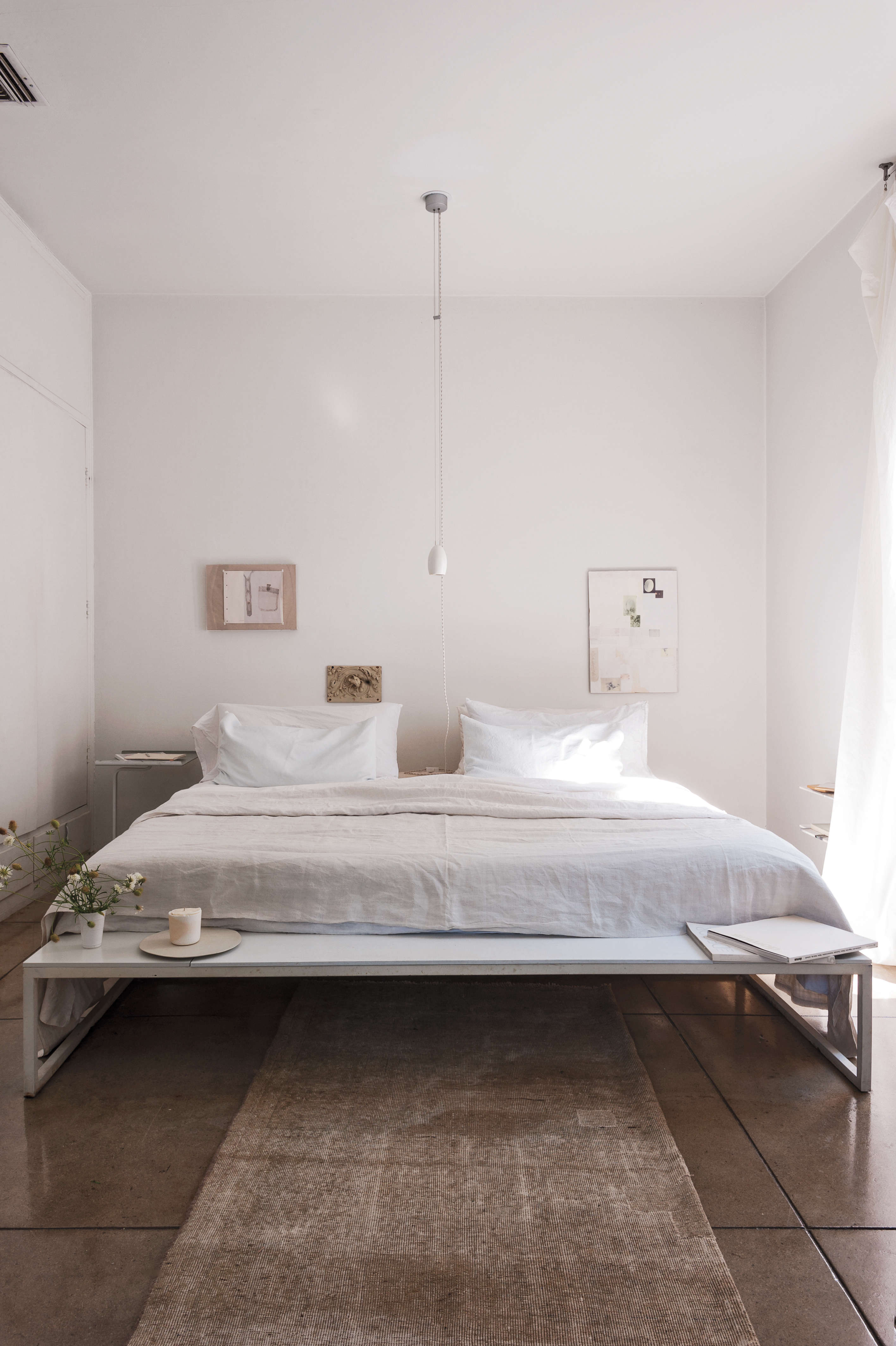
3. Show a little leg with lithe furniture.

Again, creating the illusion of more space is all about creating a sense of openness and movement. Furniture that is streamlined allows light and air to flow not just over but also under and around it, so that it appears to float in space. Again, think midcentury modern pieces, which are both low and leggy. Or consider the perfect piece of soaring furniture: the butterfly chair. (See Object Lesson: The Classic Butterfly Chair.)
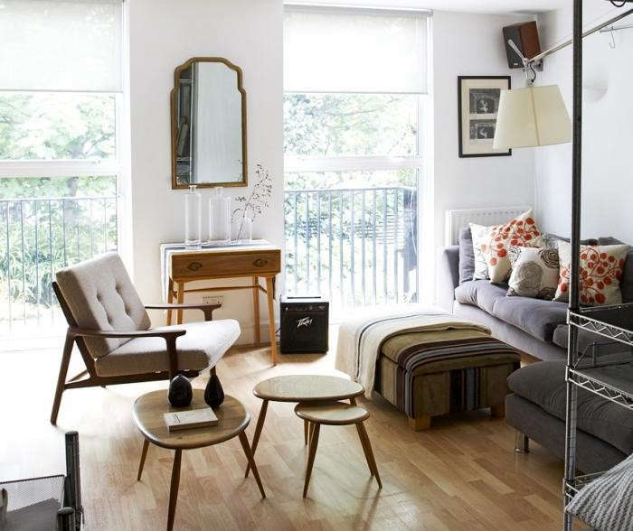
4. Mirror, mirror on the wall…

Any discussion of small spaces needs to include the idea of using mirrors to create a greater sense of openness. Not only do they reflect light, they also reflect the view, thereby tricking the eye into perceiving more space.
5. Ditch the drapes (and rugs).
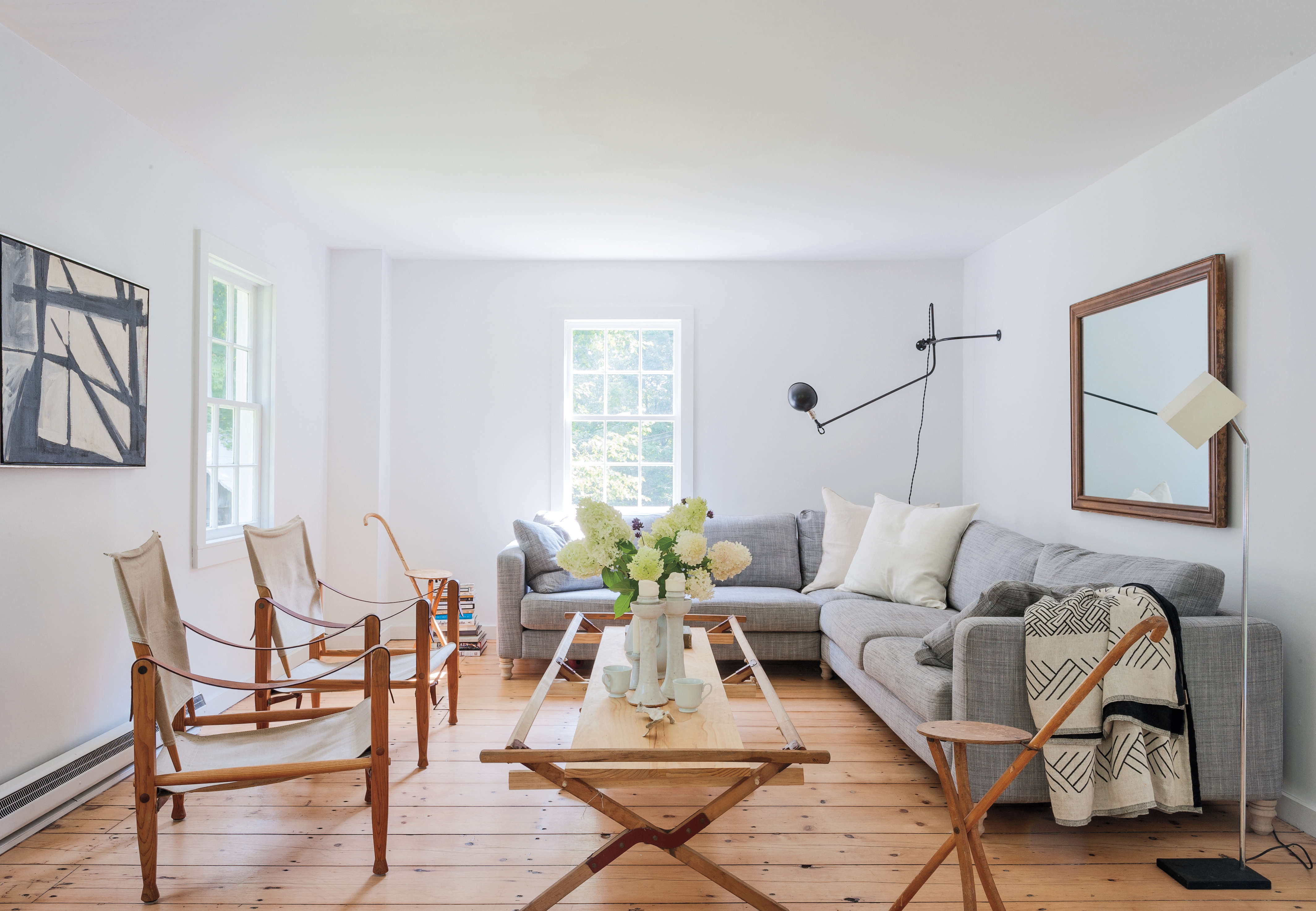
As we saw with mirrors, it’s all about tricking the eye. Curtains stop the eye from taking in the view outside, even if they don’t cover the whole window. And drapes and curtains just add more “stuff” to the room. Eliminating them keeps the space simple. If you want privacy, consider shutters or lightweight mesh or cloth blinds. Or if curtains are a must for you, use a bar that extends far beyond the window frame, so you can fully expose the window.
Ditto rugs. Cast your eye over all the small spaces in this article. Note how few have rugs or, if they do, how simple and minimal they are.

6. White it out.
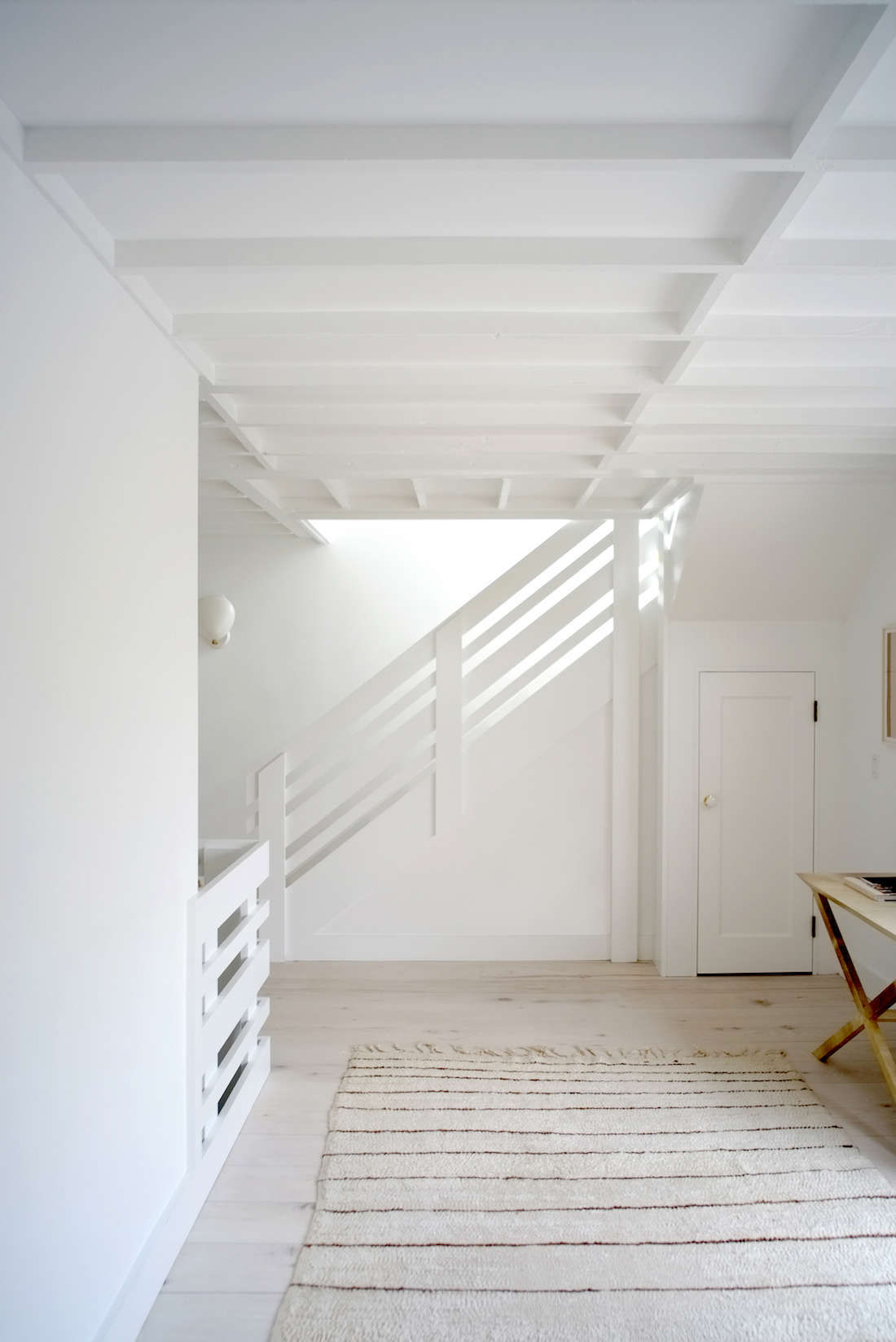
We all know of white’s reflective qualities. It opens up a room, making it feel airy and light, calm and serene. Painting the walls and ceiling the same shade of white only enhances this cloud-like effect. And it serves to blur the boundaries between wall and celling, causing your eye to travel up, essentially making the ceiling seem higher. Finally, in small spaces that can quickly become cluttered looking, white is a good choice because it simplifies a space and emphasizes the architecture. (That’s why architects love it so much. See 10 Easy Pieces: Architect’s White Paint Picks.)
If you’re worried that an all-white space will feel too cold, then pair it with warming elements such as wood, or textured elements, such as a shaggy wool throw. And remember that you don’t have choose a stark white. (See Remodeling 101: How to Choose the Perfect White Paint.)
7. Emphasize the vertical.

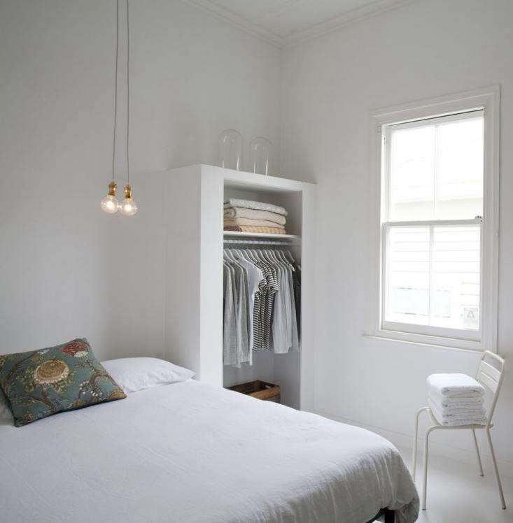
Whether it’s a tall shelf, some vertical shiplap, or the bare hanging bulb we saw in Michaela Scherrer’s bedroom above, employing one element that emphasizes the vertical space in the room will increase the sense of openness. It also enhances the feeling of movement and flow.

8. Emphasize the horizontal.
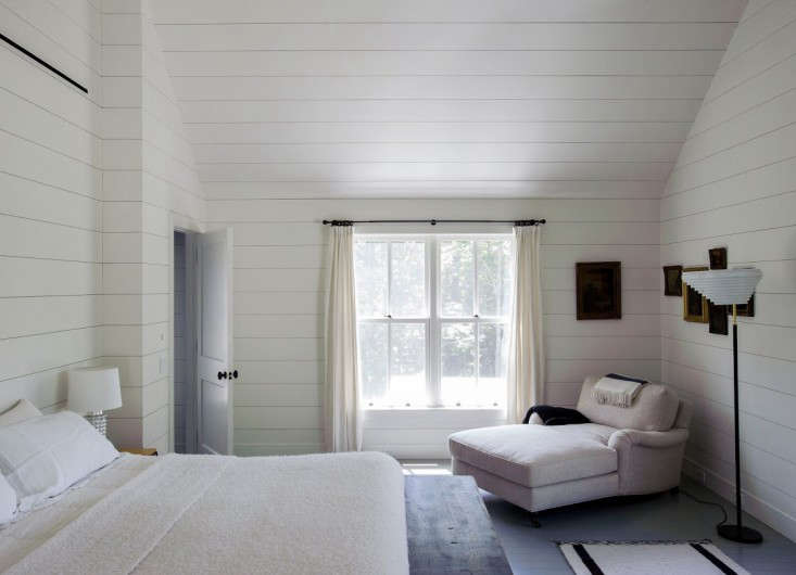
It all boils down to creating a sense of movement. Like the leggy furniture that creates a sense of dynamism, or the mirrors that reflect light and a view back into the room, anything that causes your eye to travel around a room in an intentional and orderly fashion will make it feel larger. (I say “international and orderly” because a cluttered room with lots of distracting elements will also cause your eye to travel, but in a haphazard fashion.
9. Clear a pathway.
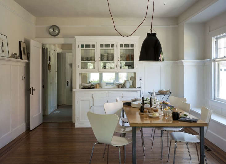
When dealing with a small room, one naturally wants to maximize the space by pushing all the pieces to the edges. But if this causes you to bump into things, it can enhance a claustrophobic feel. Sometimes it is better to group the furniture on one side of the room, so people can pass through unhindered.
10. Use breezy fabrics.

If possible, avoid heavy materials and fabrics that absorb light and weigh your room down. Linen is a perfect example of a lightweight material that will increase the sense of airiness in the room.
11. Above all, keep it simple.

Small spaces are all about editing. The more pieces, possessions, and patterns you have in a room, the more cluttered it will feel. Avoid too many knickknacks or at least group them so they read as an installation. Ditto with art; concentrate your framed pieces on one or two walls. Avoid busy patterns and overwhelming colors. Or, if you absolutely must have that William Morris–esque wallpaper, consider placing it on one accent wall. Same with color, try painting just one wall or a door and stick to a single shade. Now is not the time to embrace the whole spectrum.
The bottom line is you need to be strict with yourself (actually, this concept applies to all spaces) and intentional about everything that goes into the room. If you go for the wallpaper accent wall, then keep the rest of the room simple. If you need that huge oil painting in your living room, try having it be the only art in the room.
N.B.: This post is an update; the original story ran on December 28, 2015.
Looking for more small-space and other design solutions? See:


Have a Question or Comment About This Post?