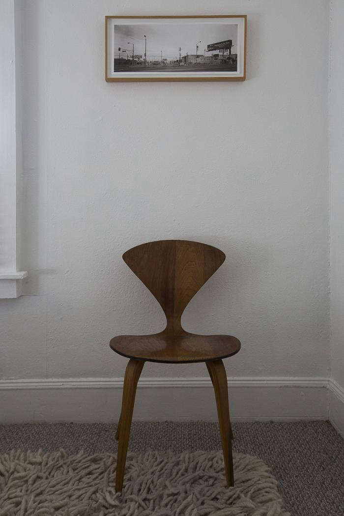
When I interviewed artist and graphic designer Wendy Furman for the post Living Large in a Tiny House, Downsizing Edition, I was struck by how much thought she had given to her surroundings (all 643 square feet of it) and her consideration of what it means to live with objects, particularly when the space is small. Here she shares her insights, with applications for spaces both large and small.
Photography by Mimi Giboin for Remodelista.
Remodelista: You used the term “reduction” in reference to how you live. Can you explain?
Wendy Furman: Design should be a feast for your senses in a restrained way. That said, someone like the architect John Pawson is too extreme–he strips down too much, especially for a visual person like me. I think he takes too much away and I want to be able to live with art. You don’t need to own everything and less is certainly more, but your possessions should bring you pleasure.

RM: Ideas for showcasing what you have?
WF: Create a few sculptural elements in the space. I grouped some green pots on top of a shelf in the kitchen, then added the art.


RM: Easy fix?
WF: Even if you are in a rental, make the space yours since you’re the one that has to live there. A coat of paint goes a long way and is a cheap investment. Flooring is a bigger investment; putting in new blinds can also make a big difference.

RM: Shopping philosophy?
WF: Take your time when you buy something. Don’t go for fads, and only buy what gives you the most pleasure. Understand that you will be living with pieces for many years. Ask yourself a lot of questions: “What does this add to my life?” “What is its beauty, its function?” It took me five years to find the perfect flatware. I looked at George Jensen and reissued Russel Wright patterns, but none of it was perfect. Then I came across the Calvin Klein Bark Cedar flatware and that was it—it was something about the combination of beauty and balance that appealed.

RM: I read recently that you should go through your wardrobe twice a year and cull what you don’t wear. How does that apply to the home?
WF: Cherish and value what you have. If it gives you no pleasure, get rid of it. Don’t be afraid to let go. I bought some small space furniture for outdoors, and I hated it so I sold it. You are reminded of your mistakes daily, so choose carefully. Look at everything with a curator’s eye.

RM: Choice of materials?
WF: Keep a simple palette, both with materials and color. I am more comfortable with wood than highly polished steel. Wood has an organic element that warms a small space but without dominating it. I carry this over to the art on my walls. I only have wood frames that are natural wood or white.
RM: Favorite color?
WF: Create a white palette. In a small house white makes everything look cleaner and larger, it’s optical. Avoid dark colors unless you specifically want to create a dramatic focal point. Once you’ve created a white backdrop allow the objects to fill the space. This comes from the museum and gallery world. Curators like to use specific whites and a lot of galleries like the Dunn Edwards palette. They have blue-whites that make the work look crisper and are great for showing off art.

WF: Flea markets are your friend. Don’t be frightened to buy something used and upgrade it. I found my Thonet chairs at a junk store then upgraded them with Knoll fabrics. I find my Russel Wright and silverware at flea markets. Collections are good, but don’t buy to buy. Find the best of the styles you collect.
RM: Rules to live by?
WF: You should never have more than five main pieces in a room, otherwise it is too much. You need a table, a lamp, and a sofa–just the basics. Apply reductive thinking.

WF: Live by the Coco Chanel rule. She recommended that when you accessorize, flip around and look at yourself in the mirror, then remove whatever catches your eye. It’s a reductive way of living. Do the same in a room with the objects you own.

RM: Your perfect space?
WF: My perfect room would contain a Rothko painting and a Gaudi chair and nothing else.
N.B.: This post is an update; the original story ran on Remodelista on March 15, 2013.
- In need of some wardrobe wrangling? See our Expert Advice: 10 Wardrobe Maintenance Essentials.
- Want more advice on going minimalist? See Expert Advice: How to Become a Minimalist, by the Author of “Goodbye, Things”
- Looking to declutter? See Expert Advice: Strategies for Successful Decluttering, from the Authors of “New Minimalism”


Have a Question or Comment About This Post?