
Minimalists need medicine cabinets, too. Our visit to architect Philip Johnson’s iconic Glass House, in New Canaan, Connecticut, was like meeting a movie star: thrilling at first sight, and then reassuringly familiar. There are many lessons to be learned from the 1949 landmark, and quite a few are surprisingly practical and affordable. Granted permission to photograph the house at dawn, we snooped in cupboards and opened closed doors (with the help of a curator), and came away with a list of ideas worth applying to our own far less daring houses.
Photography by Matthew Williams for Remodelista.
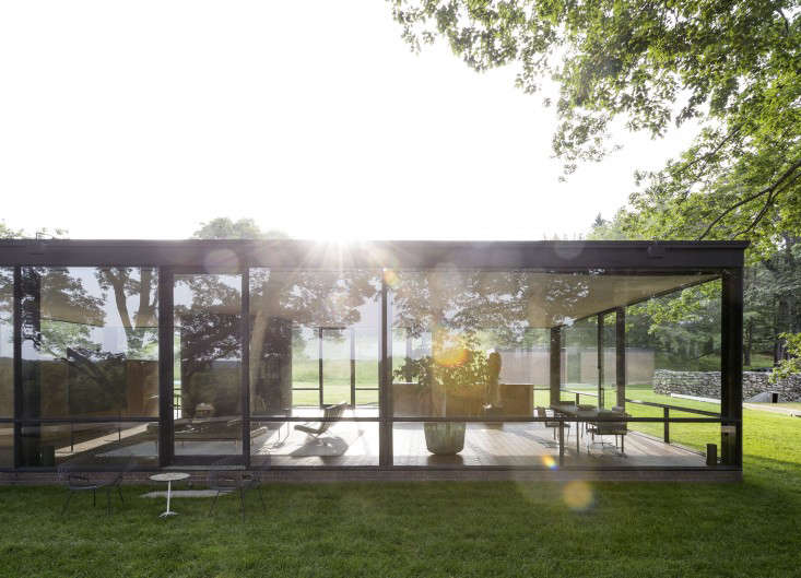
Above: Set on 49 secluded acres, the Glass House was the first of an eventual 14 structures that Johnson added to the compound, including an underground art gallery; a compact (and much more private) one-bedroom brick house for himself and longtime partner, curator David Whitney; and a red and black asymmetrical gate house he dubbed Da Monsta. Johnson spent 50-plus years living and working on the estate, until his death at 98 in 2005. And all the while, he also orchestrated its seemingly wild plantings, adding and subtracting trees, branches, and tendrils–and directing his crew with a megaphone–to create vistas worthy of a structure with all windows. As Paul Goldberger put it, “The elegantly arranged landscape is as much a part of the house as the furniture.”
The estate, now known as The Glass House, belongs to the National Trust for Historic Preservation and functions as a vital if under-the-radar museum offering contemporary art shows, events, tours (reservations required), plus a Glass House Design Store in downtown New Canaan. And for a contribution of $30,000, you can spend a night in the Glass House. To prepare the place for guests, Crista Bazoian, manager of the shop, went looking for new bedding and found it right here on Remodelista: She ordered an ensemble from one of our favorite sources, Rough Linen. When we heard, we had to take a look, and so did Tricia Rose, owner of Rough Linen, who immediately hopped on a plane from SF to join us. Here’s what we discovered.
1. Timeless design really can last a lifetime.
Above: Johnson’s living room furniture is by his friend Ludwig Mies van der Rohe. (The Glass House itself was directly inspired by a model of Mies’s Farnsworth house in Illinois.) After seeing Mies’s German Pavilion at the International Exposition in Barcelona of 1929, Johnson ordered the furniture for his own New York living room and then used it in the Glass House. Once in place, not a single piece, down to the coffee table’s round ashtray and square box, ever changed (since the sixties, though, the stool has sported a cigarette burn left by Andy Warhol).
Note the intimate placement of the seating for easy conversation and the lounge option (in this house, comfort is welcomed in, if not allowed to reign supreme: “You can feel comfortable in any environment as long as it’s beautiful,” said Johnson).
N.B.: The Barcelona Chair and Barcelona Stool are available from the Glass House Design Store, and proceeds help preserve and maintain the museum.
2. There are all kinds of ways to build a wall.

Above: How to divide a glass cube into living, sleep, and eating quarters? Johnson built dual-function barriers, including a standing painting and a long wooden storage cupboard that sections off the bedroom (and ensures clutter-free living). The cabinet, which also serves as a headboard, holds blankets and bedding, tableware, and household supplies.
3. Display art at a human level.
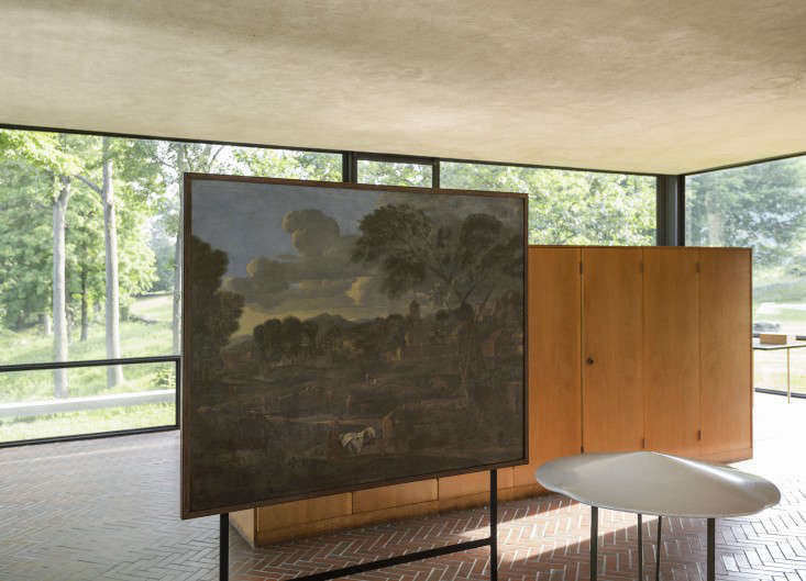
Above: Johnson purchased Nicolas Poussin’s 17th-century painting, The Burial of Phocion, at the recommendation of Alfred H. Barr, Jr., the Museum of Modern Art’s first director (Johnson himself served as MoMA’s first curator of architecture). The painting shows a landscape that uncannily evokes the pastoral scene on view from the windows. Its ingenious standing display easel is arranged so that the base meets the horizon line outside.

Above: Johnson mounted the painting on a board and elevated it on a metal framework, an ideal solution for a house with no walls to hang things on (but, given the painting’s sun exposure, not exactly an archival approach).
4. Incorporate air space into your room design.
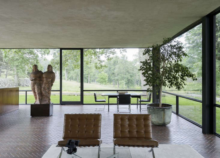
Above: The interior is just over 1,700 square feet (with 10 foot, 4 1/2 inch tall ceilings), and each part has plenty of breathing room. The seating area overlooks a dining table designed by Johnson and a papier-mí¢ché maquette of Two Circus Women, a sculpture by Elie Nadelman. When Frank Lloyd Wright visited, he reportedly insisted the sculpture was out of place and moved it. After he left, Johnson put it right back. As he explained, “A room is only as good as you feel when you’re in it.”
5. Give in to window covers.

Above: Though the Glass House isn’t visible from the road, Johnson eventually succumbed to sliding panels to block the sun and prevent interlopers from seeing inside–Yale architecture students were among the many known to appear uninvited for a look around. Johnson’s woven window panels are from Conrad, which still specializes in custom sun shades. The ones in the house are similiar to the company’s Toksu grass design.
6. Cover up what you don’t want to display.
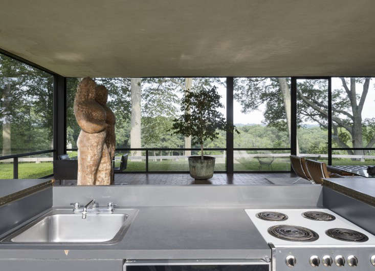
Above: How to plunk a working kitchen into an eyesore-free, open-plan room? Johnson devised a compact but extremely functional galley–and then he figured out a way to make it disappear.

Above: Presto chango: A hinged walnut top (with rubber-footed legs) folds down over the sink and stove, turning the space into a martini bar and buffet. During the museum’s parties at the house, it’s still put to use.
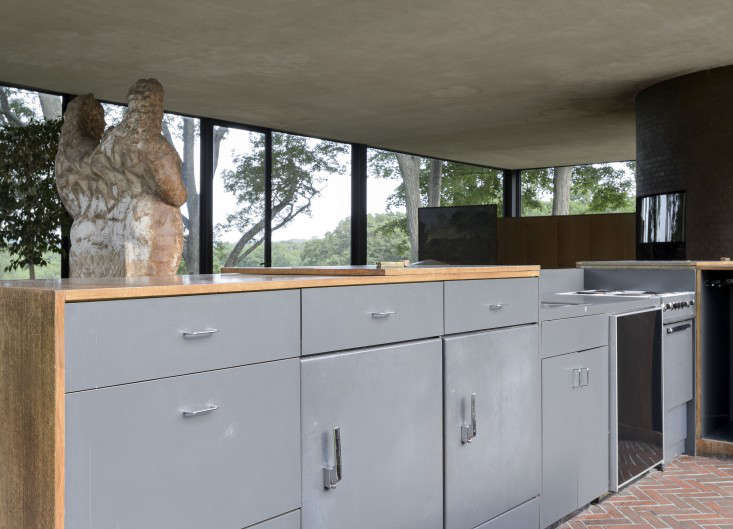
Above: As for the appliances, Johnson turned to Kitchens by Dean, in New Canaan, for his stainless steel sink, GE fridge, freezer, 24-inch stove, and wooden cabinets–all tidily tucked under the counter. To give the setup unity and an industrial look, Johnson painted it all gray.
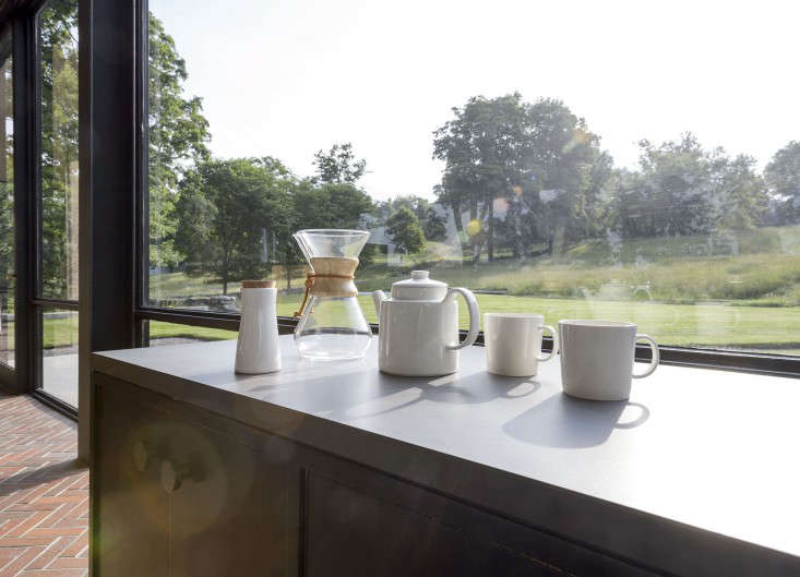
Above: For coffee and tea, the kitchen is stocked with a Chemex coffee maker and the Teema collection of pared-down tableware by Finnish designer Kaj Franck–like the Glass House, Franck’s ceramics are based on square, circular, and rectangular shapes. Of course, Johnson always kept his wares in a kitchen cabinet when not in use. (Read about Teema in Object Lessons; the pieces shown here are available at the Glass House Store.)
7. Brick makes interesting, durable flooring. (And it works well with radiant heat.)

Above: Is it time to rediscover herringbone brick? The Glass House’s floor is more indestructible than wood (if not easier on the legs). And it conducts heat well–the house has a hydronic radiant-heat system in which hot water flows through piping under the bricks. Go to Remodeling 101 to learn 5 Things to Know about Radiant Floor Heating. And see Brick Makes a Comeback for an interesting use of brick in a contemporary remodel, herringbone floors included.
8. A curve or two is pleasing to the eye.
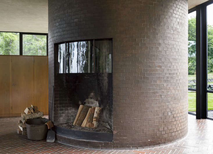
Above: The house’s only fully enclosed room is a brick cylinder that serves on one side as a fireplace. When embers are lit, the room’s cross breeze is said to ignite the fire.
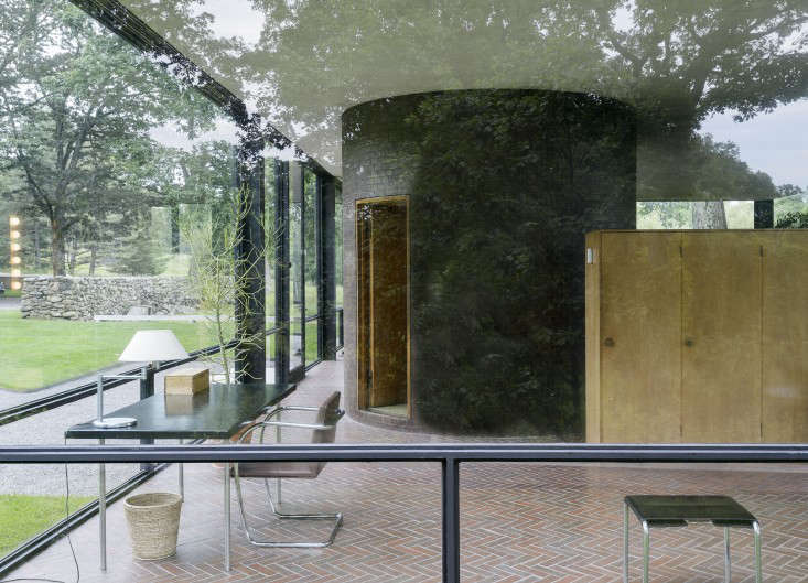
Above: On the other side, the cylinder contains a bathroom conveniently right off the bedroom. “You haven’t any straight lines in your body. Why should we have straight lines in architecture?” said Johnson. “You’d be surprised when you go into a room that has no straight line how marvelous it is that you can feel the walls talking back to you, as it were.”

Above: The bathroom has a curved wood door and frame (with faint marks on it from Johnson’s wheelchair during his last stays in the house).
9. Consider a full-length medicine cabinet.
Above: Sheathed in pale green Italian glass tiles, the bathroom’s storage is cleverly tucked into its outsize medicine cabinet. For a similar design, consider Restoration Hardware’s Frame Metal Full-Length Medicine Cabinet. Urban Archaeology carries a range of Glass Tiles (but be warned: We’ve heard that the edges of glass tiles can be razor sharp and require a lot of filing).
10. Apply texture in unexpected places.
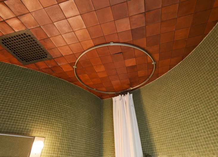
Above: Johnson loved to experiment with materials: He built an open-air Ghost House on the property from chain link fencing; constructed Da Monsta from gunite, a plasterlike swimming pool composite; and applied leather tiles on the bathroom ceiling. True, they’re not practical for a small space with high humidity, but because Johnson and Whitney more often showered in the brick house across from the Glass House, the leather has held up.

Above: The shower has a shades-of-Pompeii circular tiled frame and a curtain on a metal ceiling track.
11. A bedroom doesn’t need much more than a bed.
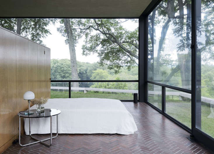
Above: A 1927 Mies van der Rohe glass-and-tubular-steel table stands next to a ghost of a bed cloaked in a woven cotton spread that Johnson brought back from a trip to Greece. For simplicity of line, all else, including pillows, is kept in the surrounding cupboards. Johnson’s dictum: “Pick very few objects and place them exactly.”
The windows were sized according to the largest panels of glass available at the time and the lower panels are chair-rail height. Waking up to a snowstorm is one of the biggest thrills. See Bedtime Under Glass for a report by Guy Trebay of the New York Times, who not so long ago got to test out a night at the house.
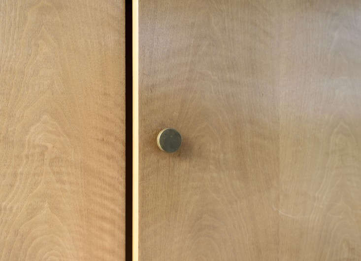
Above: The cupboards have simple patinated brass knobs.

Above: The windows are steel-framed and secured with brass hardware.
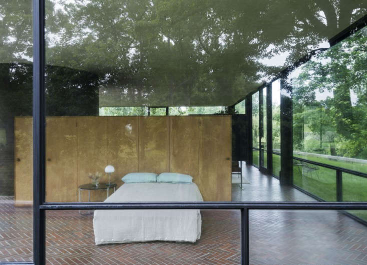
Above: When there are overnight guests, the bed is dressed in its new Rough Linen bedding.

Above: The duvet cover is Rough Linen’s Orkney design, paired with the company’s Simple Pillow Slips and St. Barts Blue Shams and a white linen Sheet. On arrival at the house, the company’s creator, Tricia Rose, immediately whipped the bed into shape. She used her 7 Secrets to Make a Perfect Bed–but refrained from diving in naked.
12. Layer your lighting.

Above: Alongside exposed steel I-beams, each corner of the house is lit by canister lights. After moving in, Johnson hired lighting designer Richard Kelly to minimize glare and save him from having to stare at his own reflection after dark. Kelly responded by creating a subtle system of interior up lights and exterior down lights.
13. Plants make good roommates.
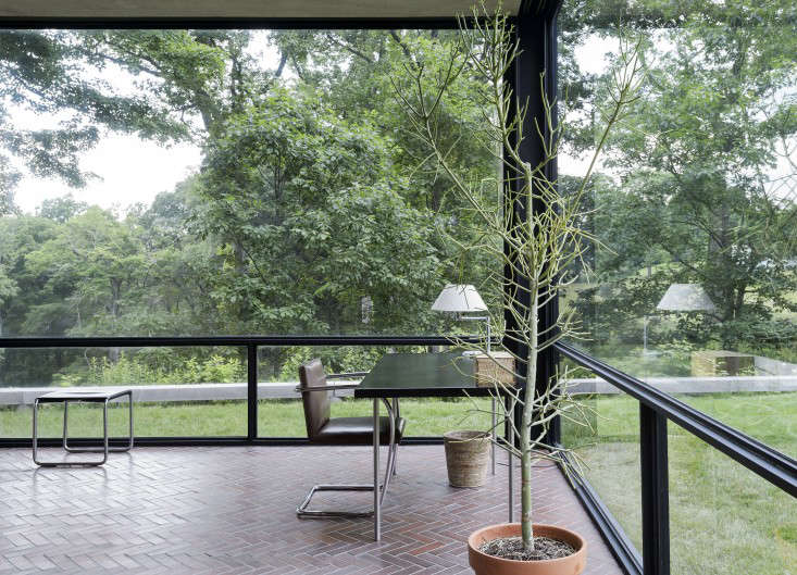
Above: A spindly pencil cactus brings the outdoors in and keeps the room from feeling chilly. It stands next to a Mies van der Rohe tubular steel and leather desk and Brno Chair. On Gardenista, join our debate about Plants in the Bedroom and learn about Johnson’s succulent of choice in the New “It” Houseplant.
14. Borrow freely from others.

Above: Johnson openly grabbed the idea for an all-glass house from Mies van der Rohe–he even managed to get his built first–and found inspiration all over, from antiquity to the Bauhaus to Frank Gehry’s aversion to right angles. He encouraged people to design their own houses and, while doing so, to borrow brazenly: “I got everything from someone. Nobody can be original. As Mies said, ‘I don’t want to be original. I want to be good.'”
For more inspiration, browse our Architecture gallery, and if you’re looking to hire an architect, consult the Remodelista Architect/Designer Directory.
Instant design help? See 11 Zero-Cost Room-Changing Ideas.


Have a Question or Comment About This Post?